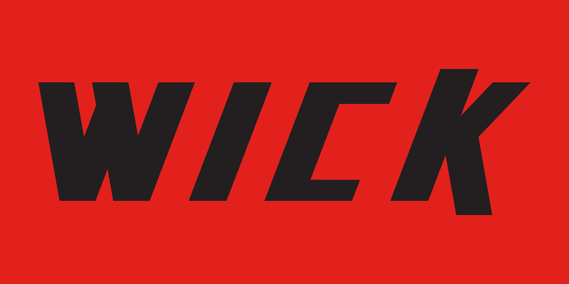
The Wick logo was for a school project, I decided I wanted to do an angled and sharp design because that is my favorite style and I think that it is the most eye catching type of logo. The logo would be used for a car brand that has a focus of making fast and futuristic cars.
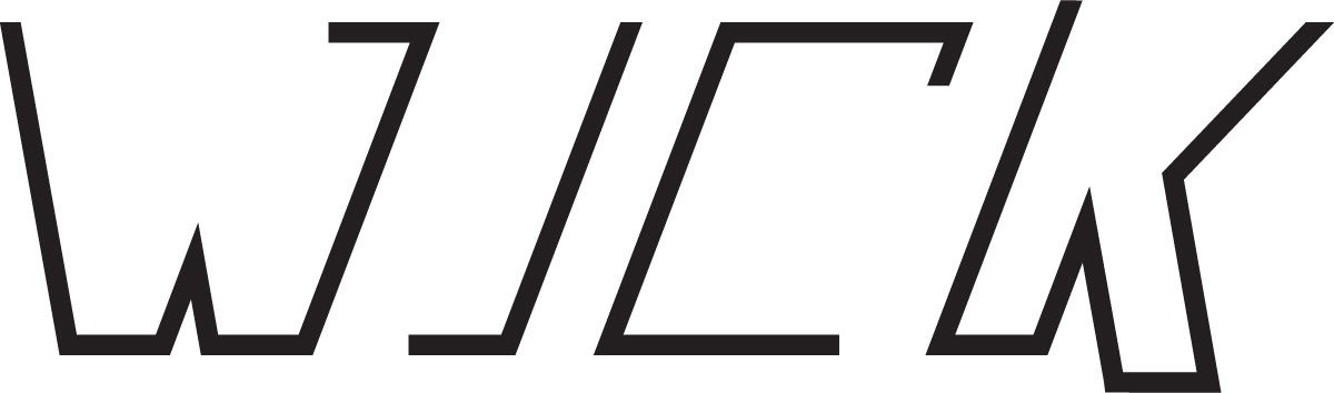
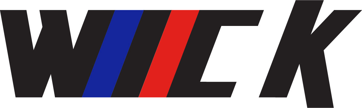
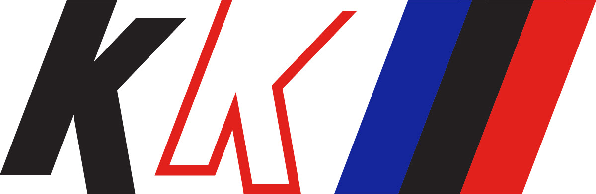
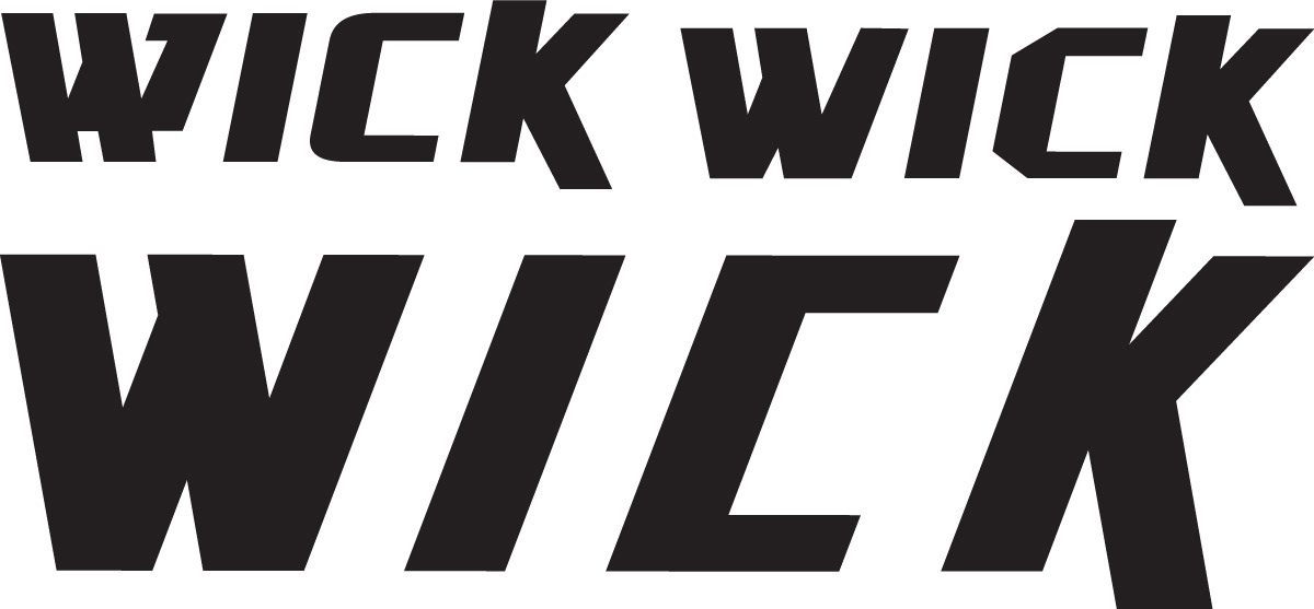
This is the progression of the logo. I started with a font and then took out the curves, made all the lines parallel, and made all the spaces and letters equal thickness.