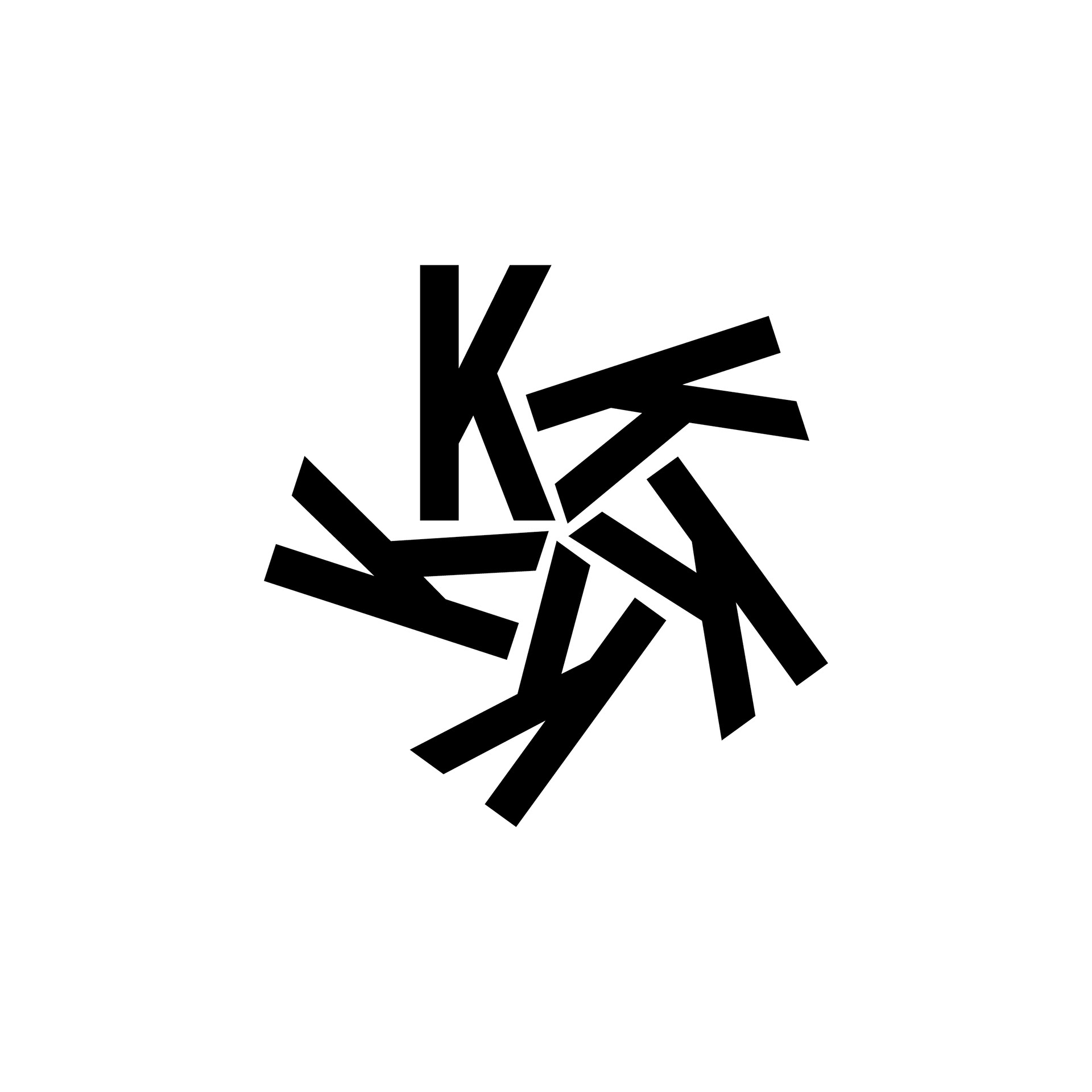
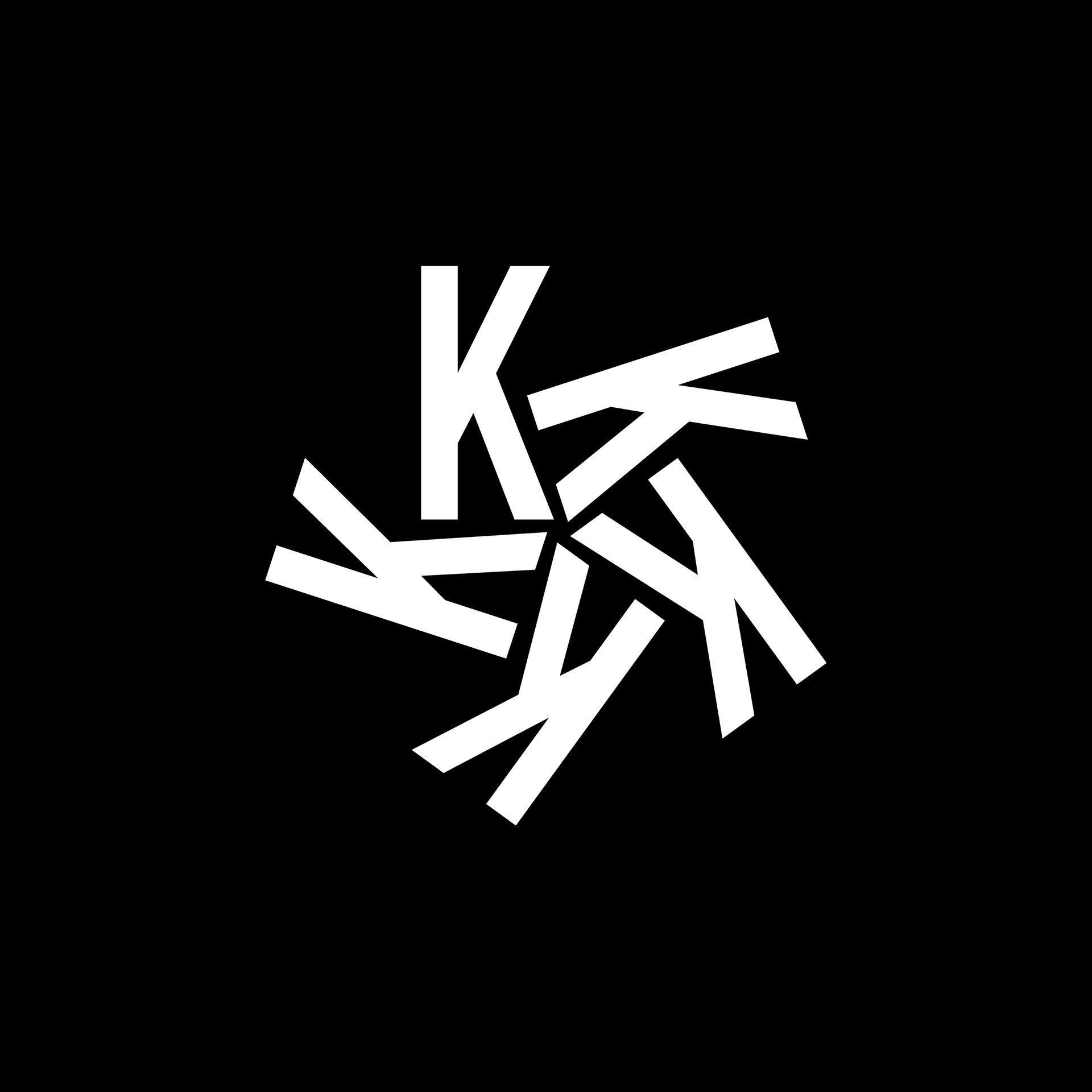
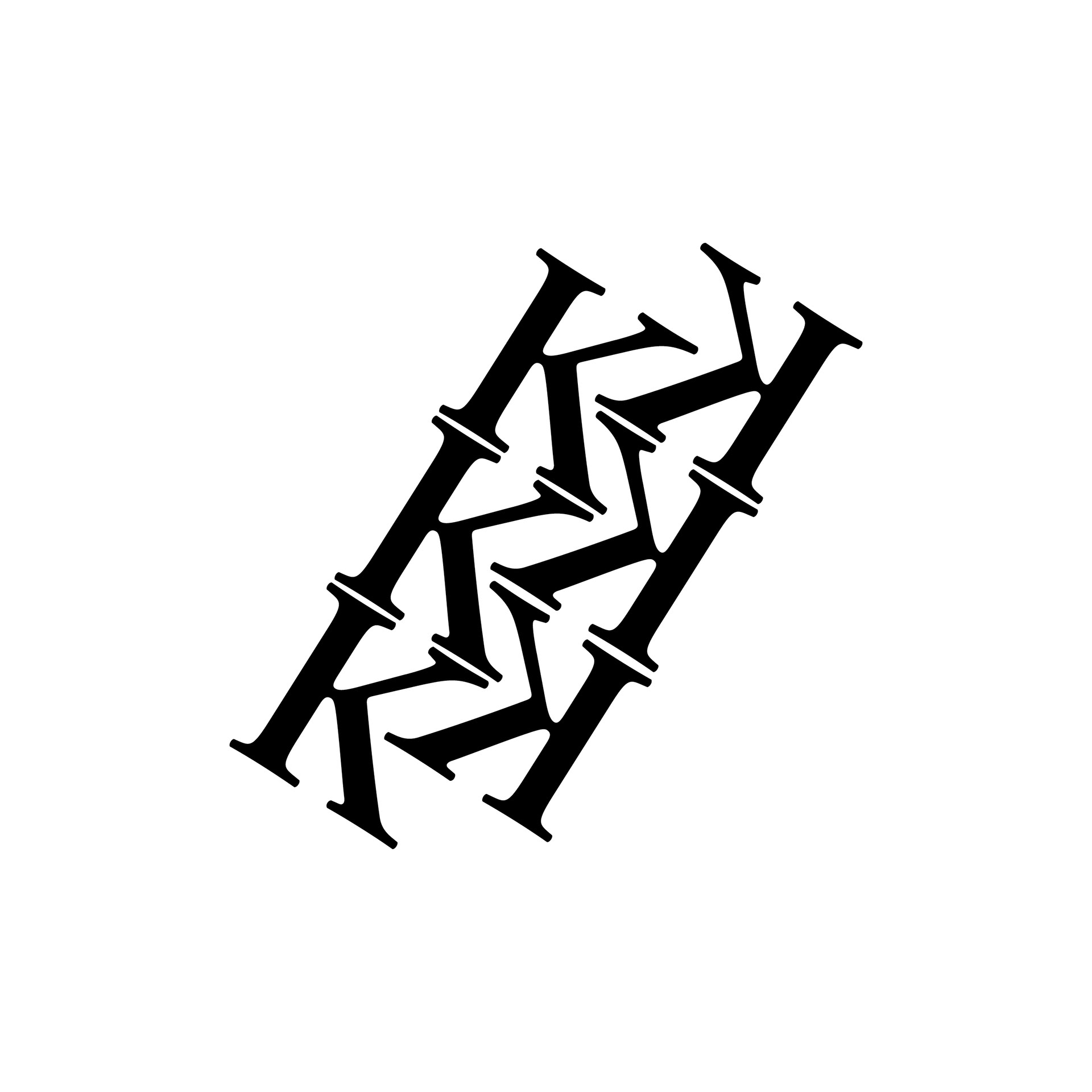
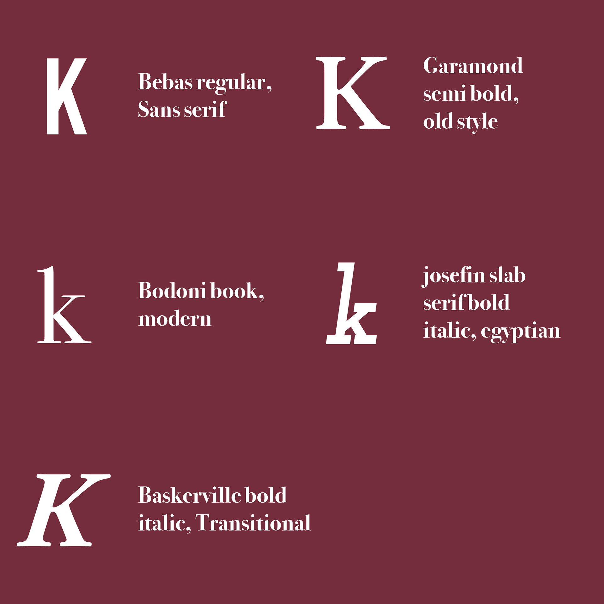
A study of the letter K in different font families. colors were reversed and the designs were edited to appear optically the same.
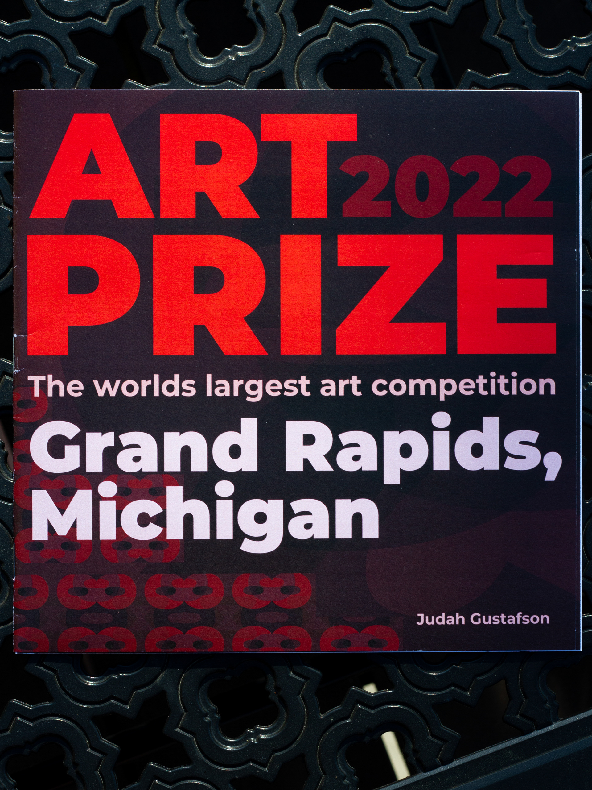
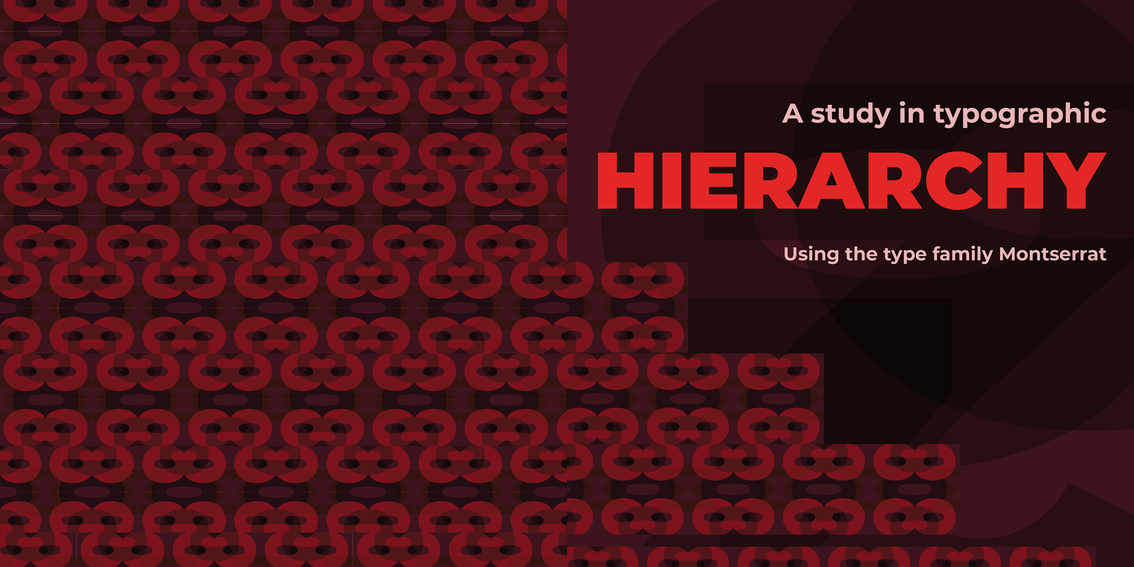
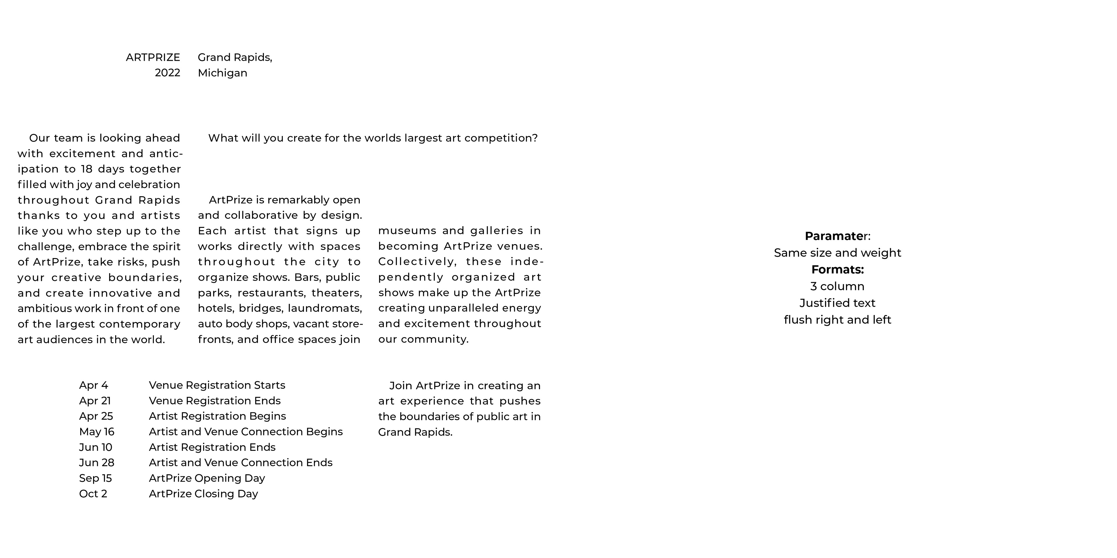
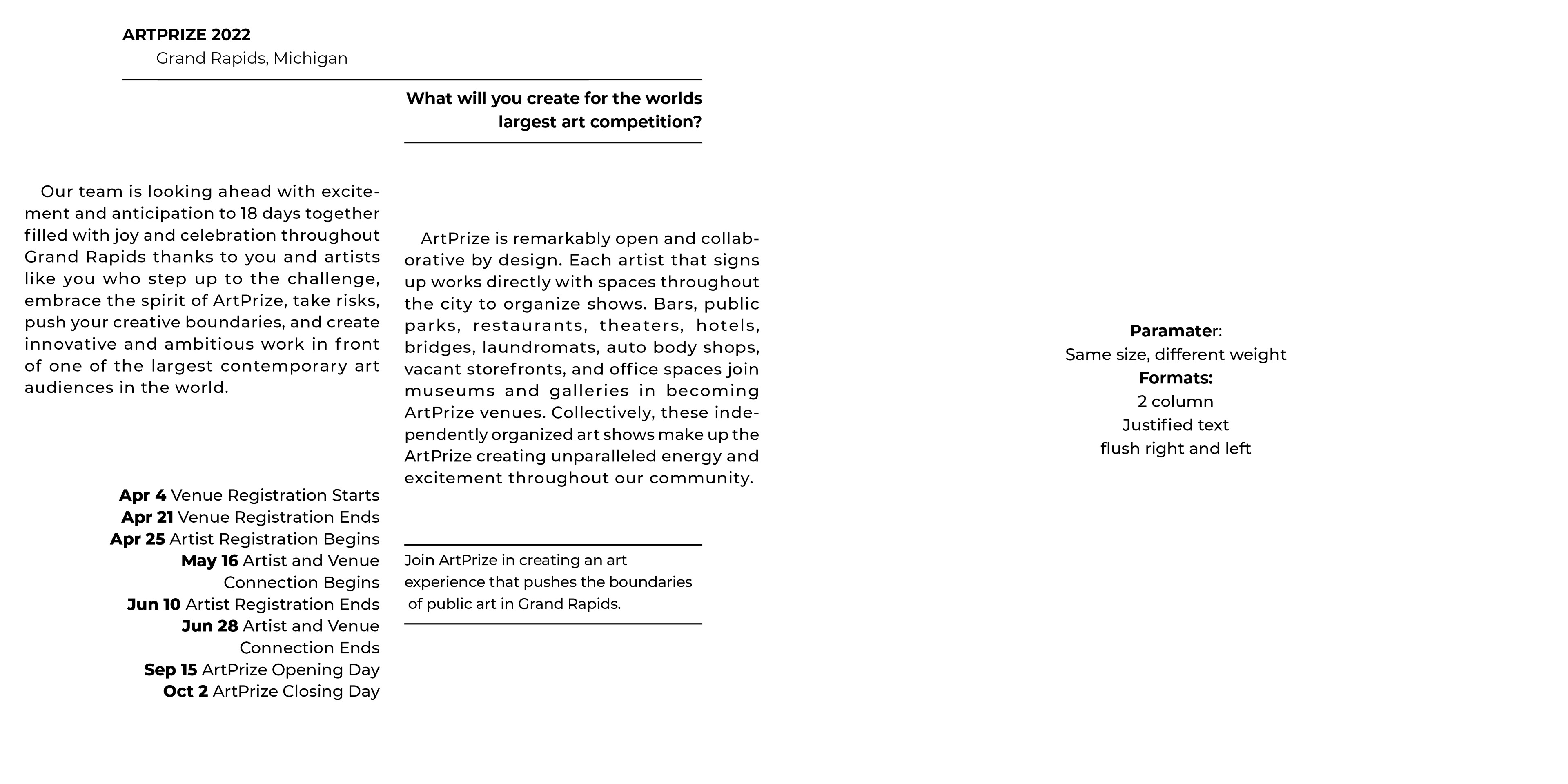
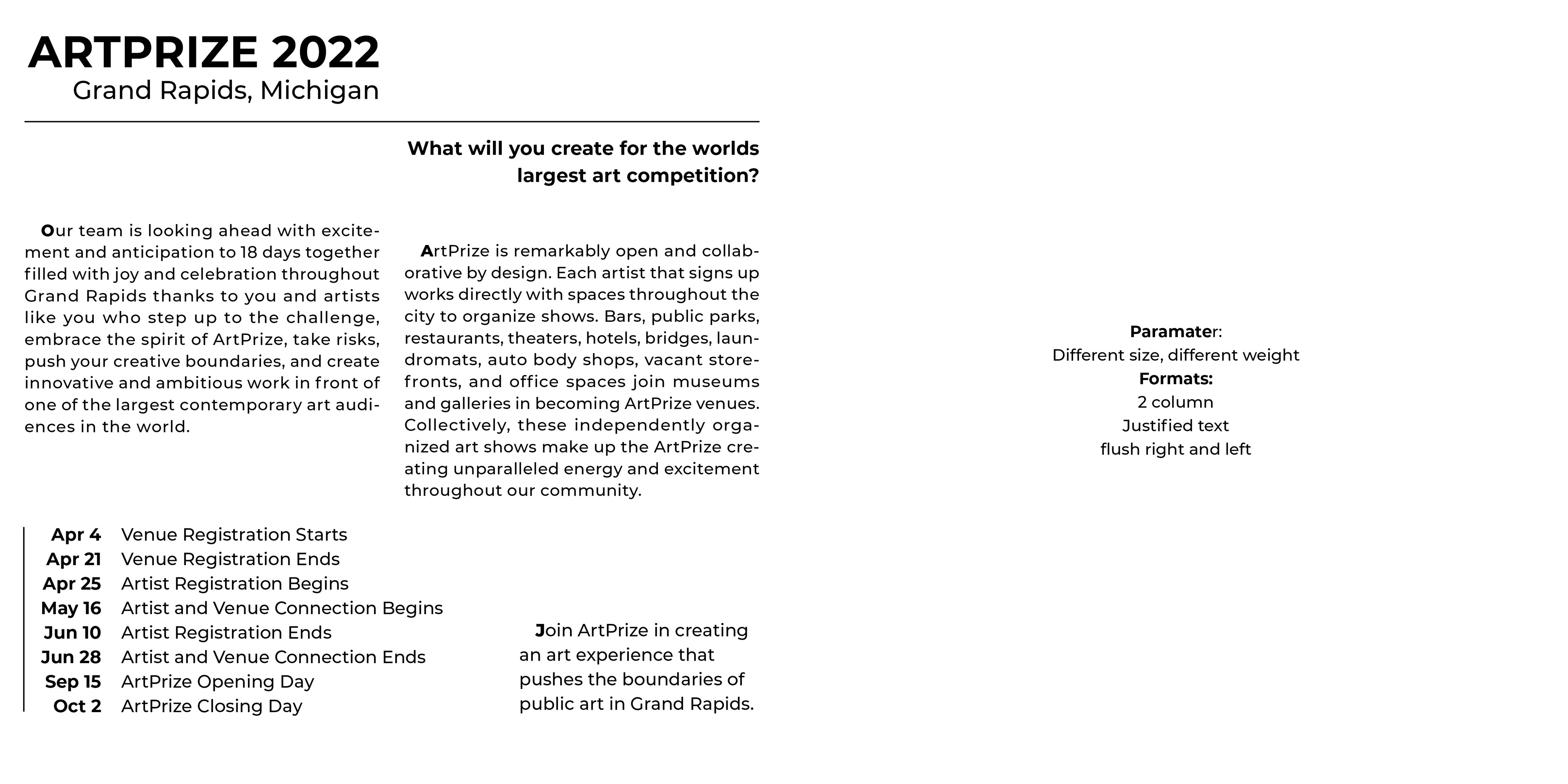
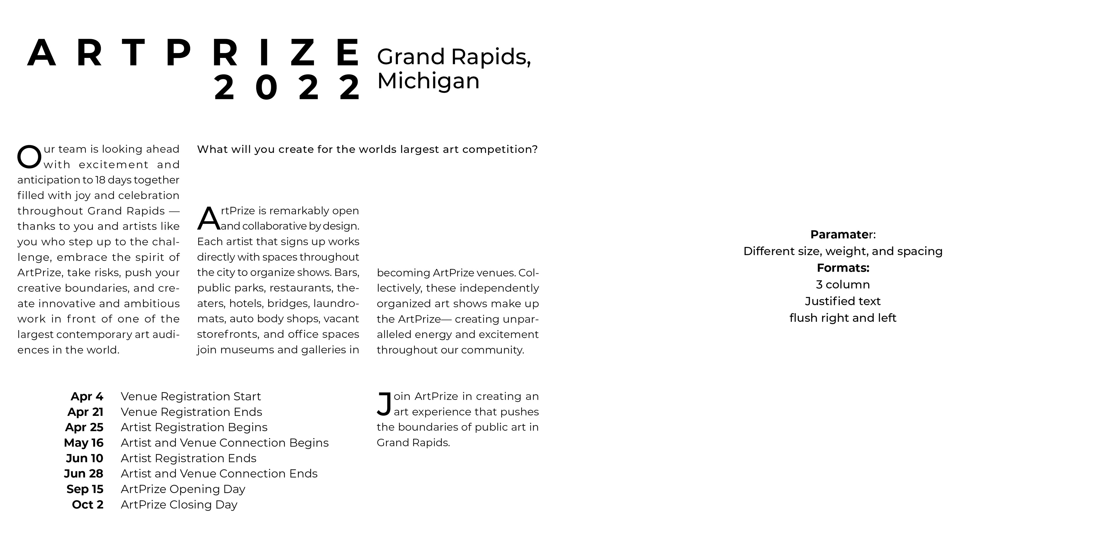
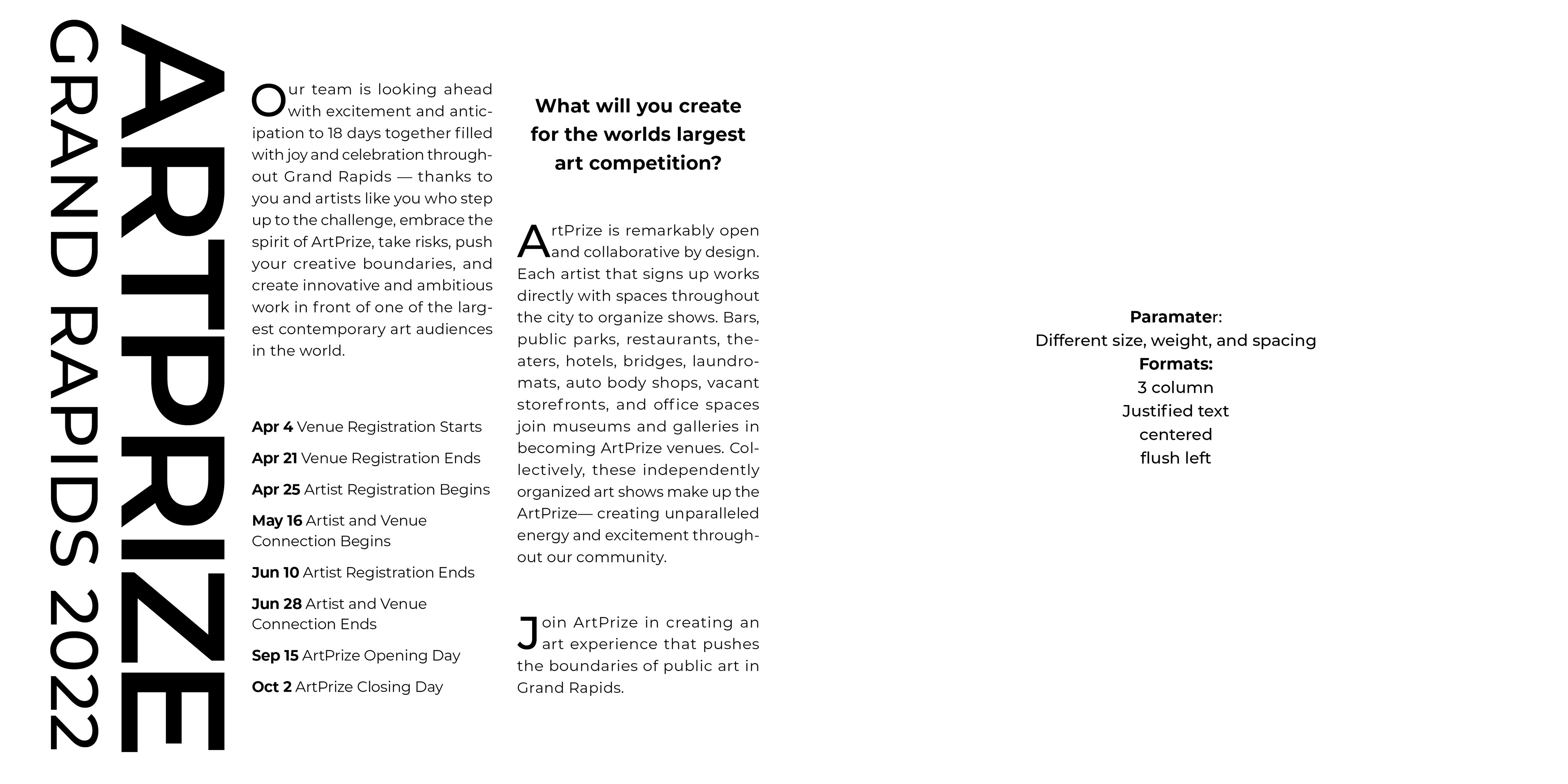
Ad design exploring the concept of typographic hierarchy. Art Prize 2022 was the event chosen for the advertisement. Each page was a variation of the ad with specific requirements. Font family was Montserrat. Printed as an 8"x8" booklet.

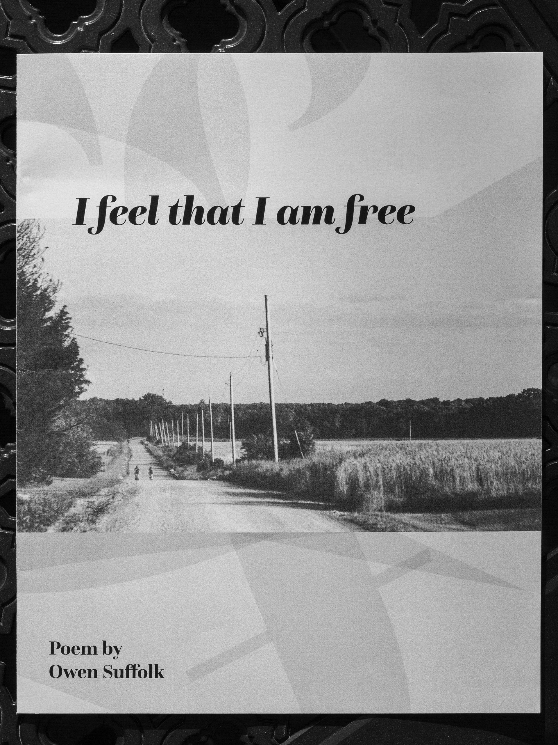
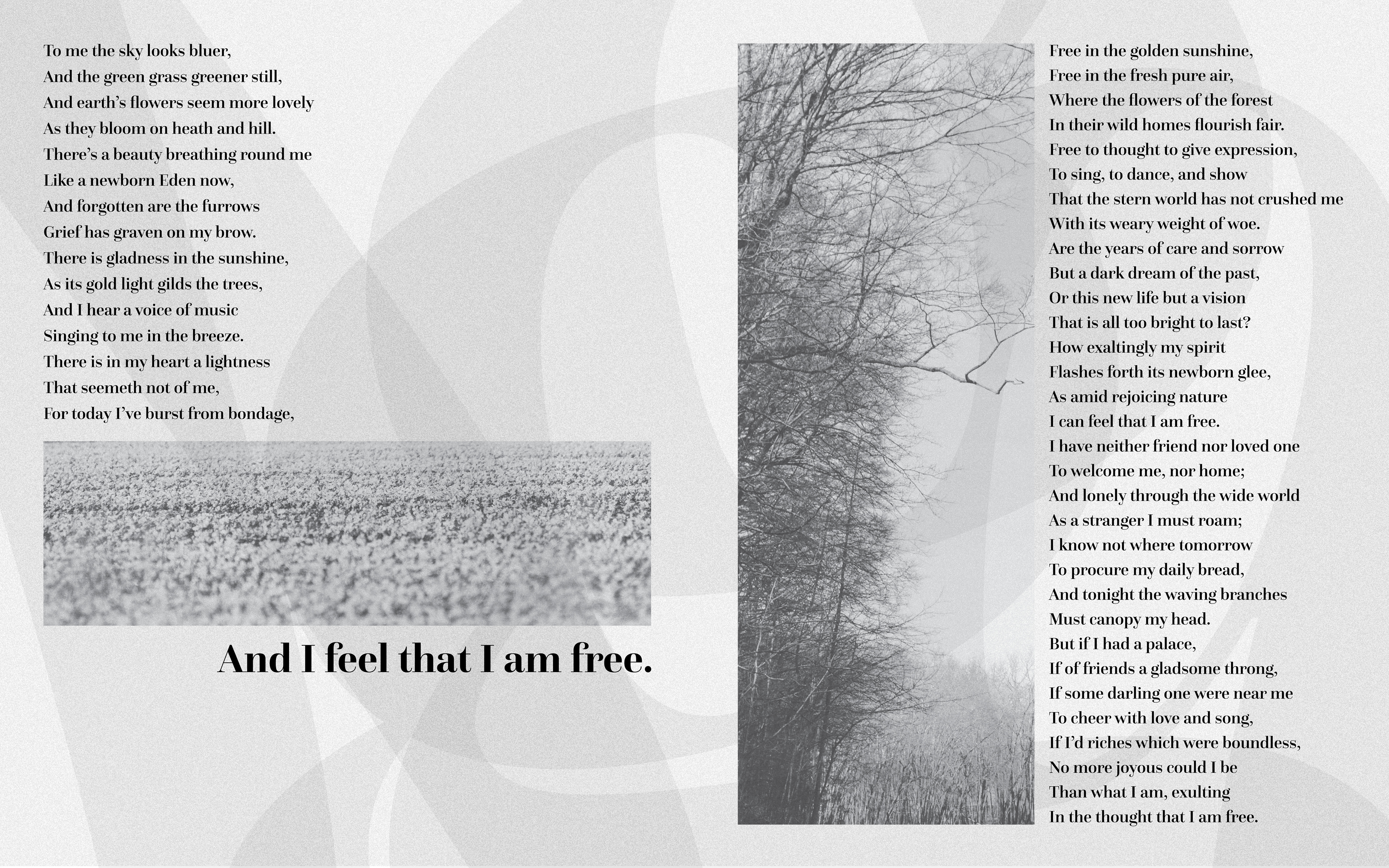
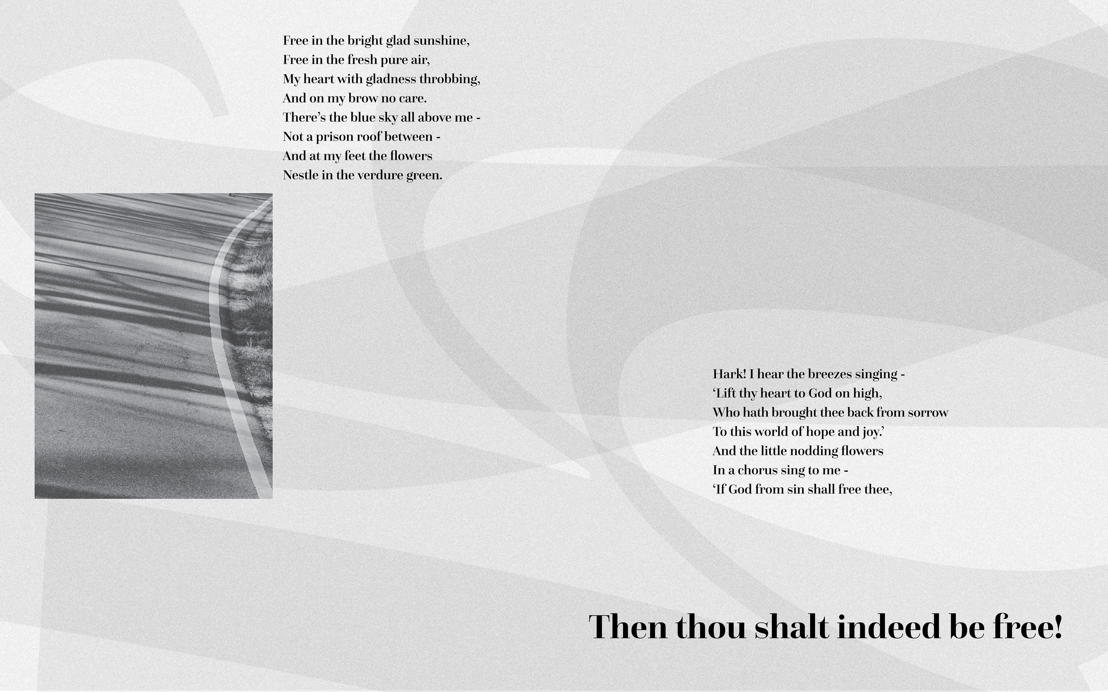
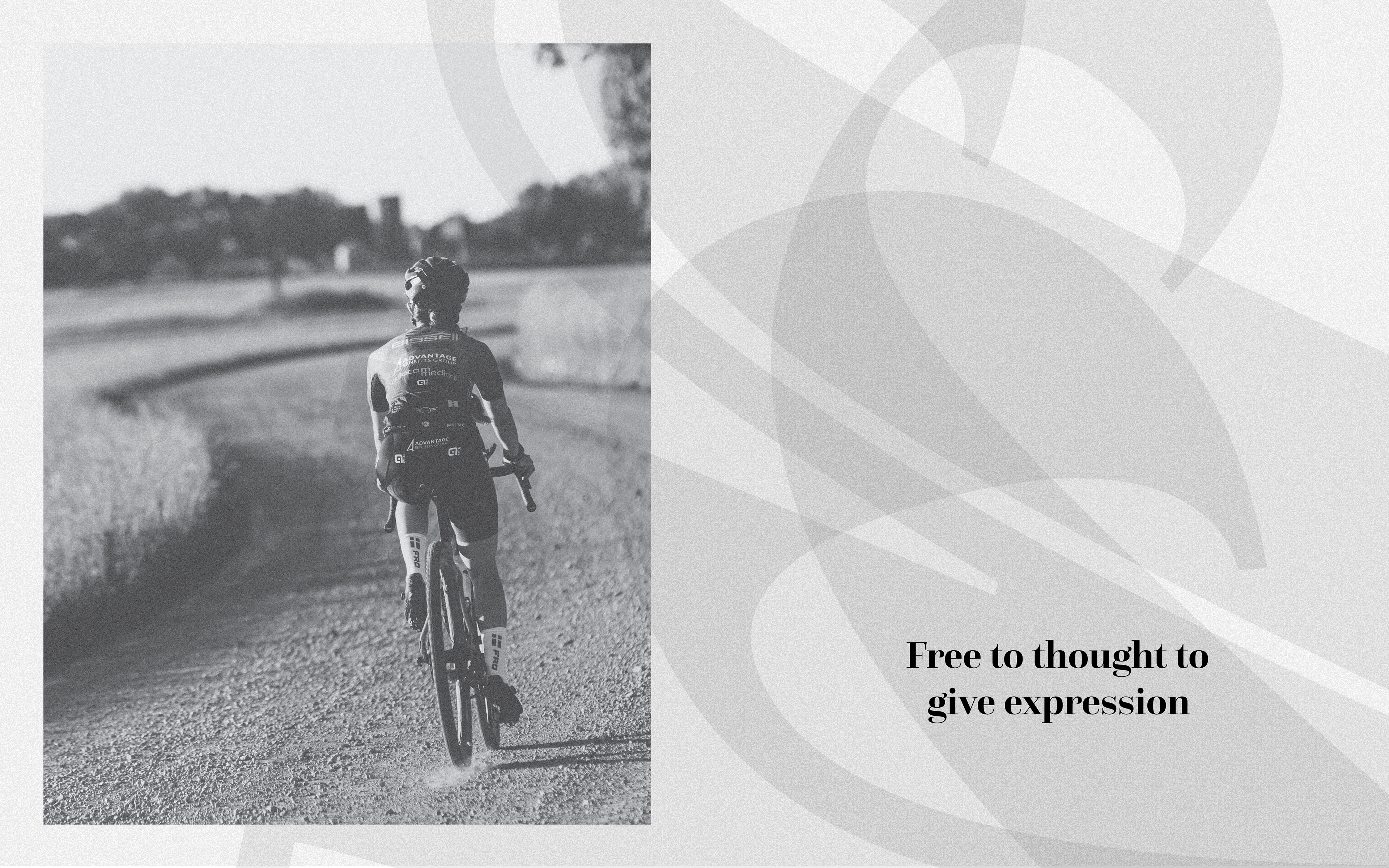
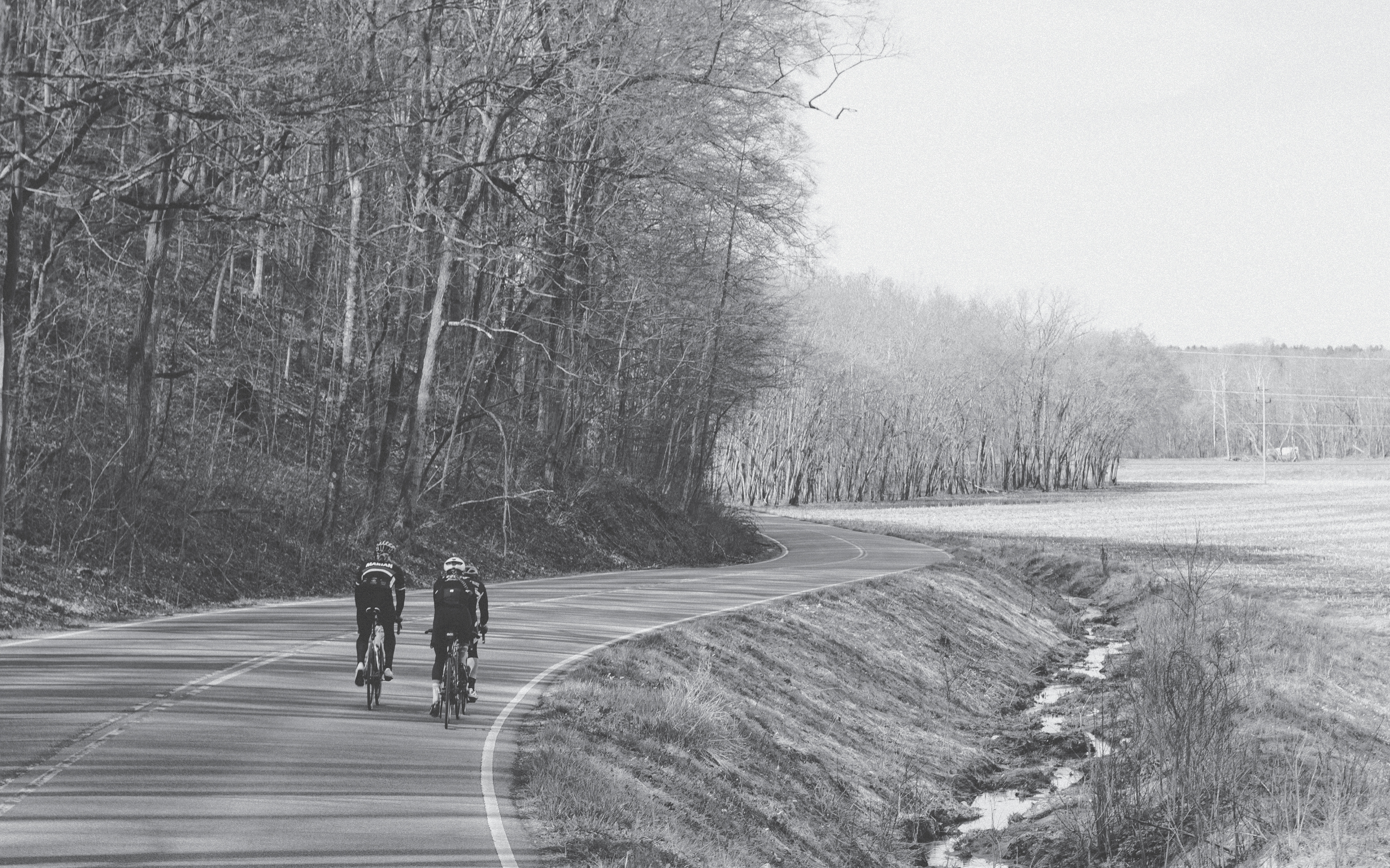
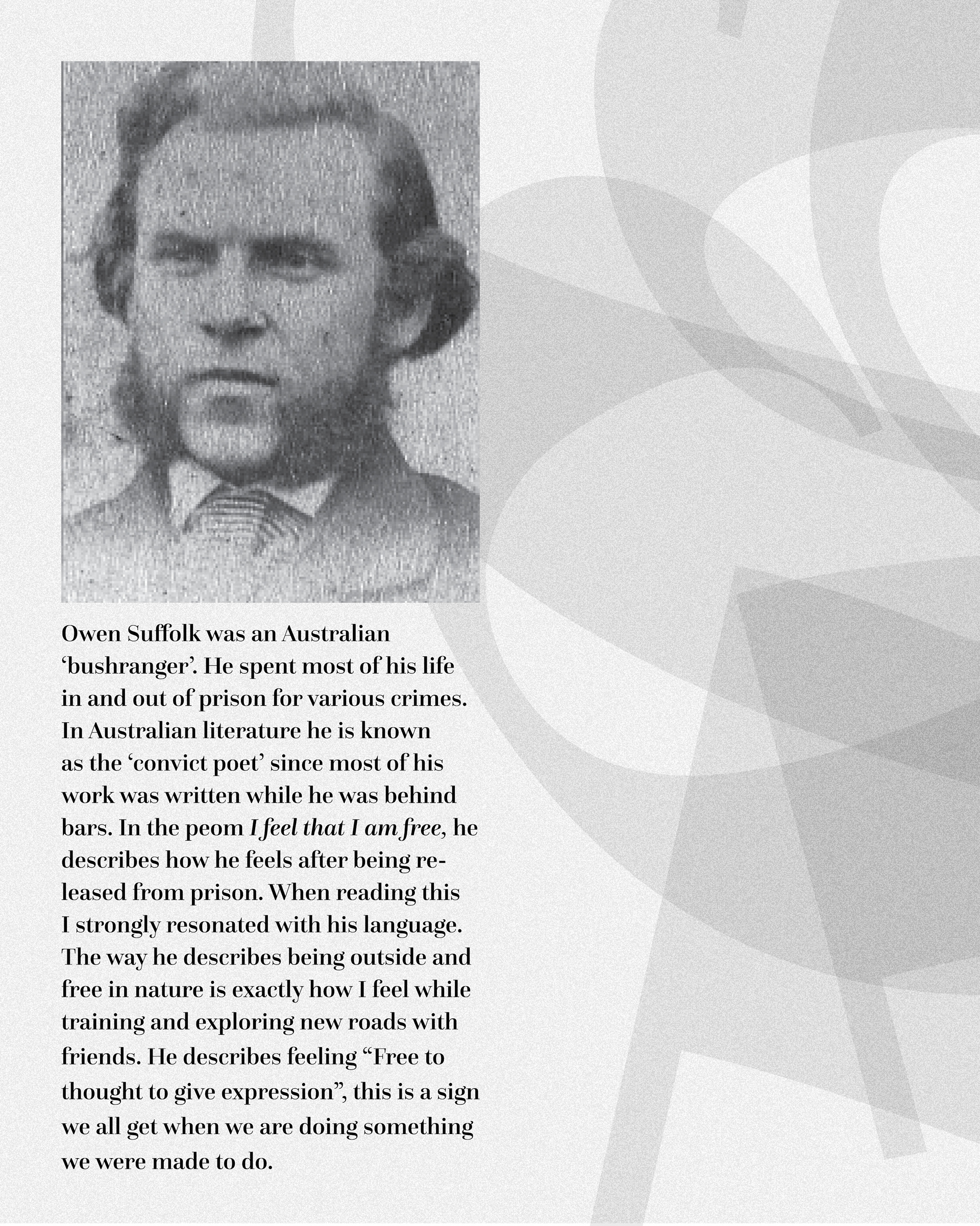
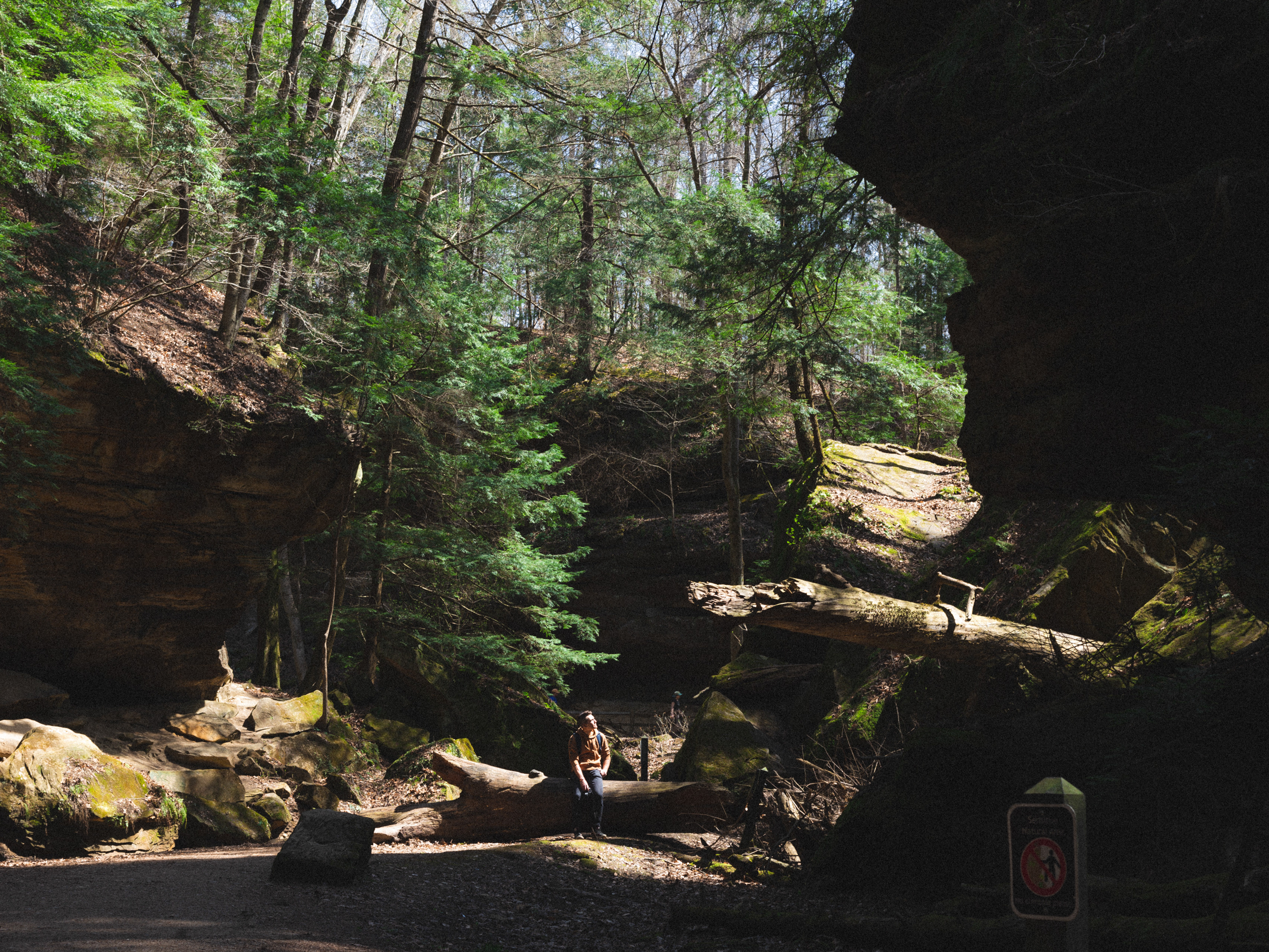
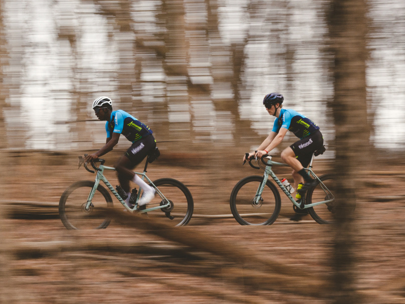
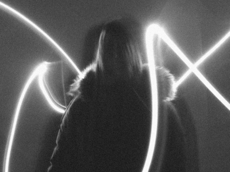
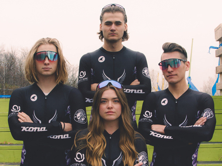
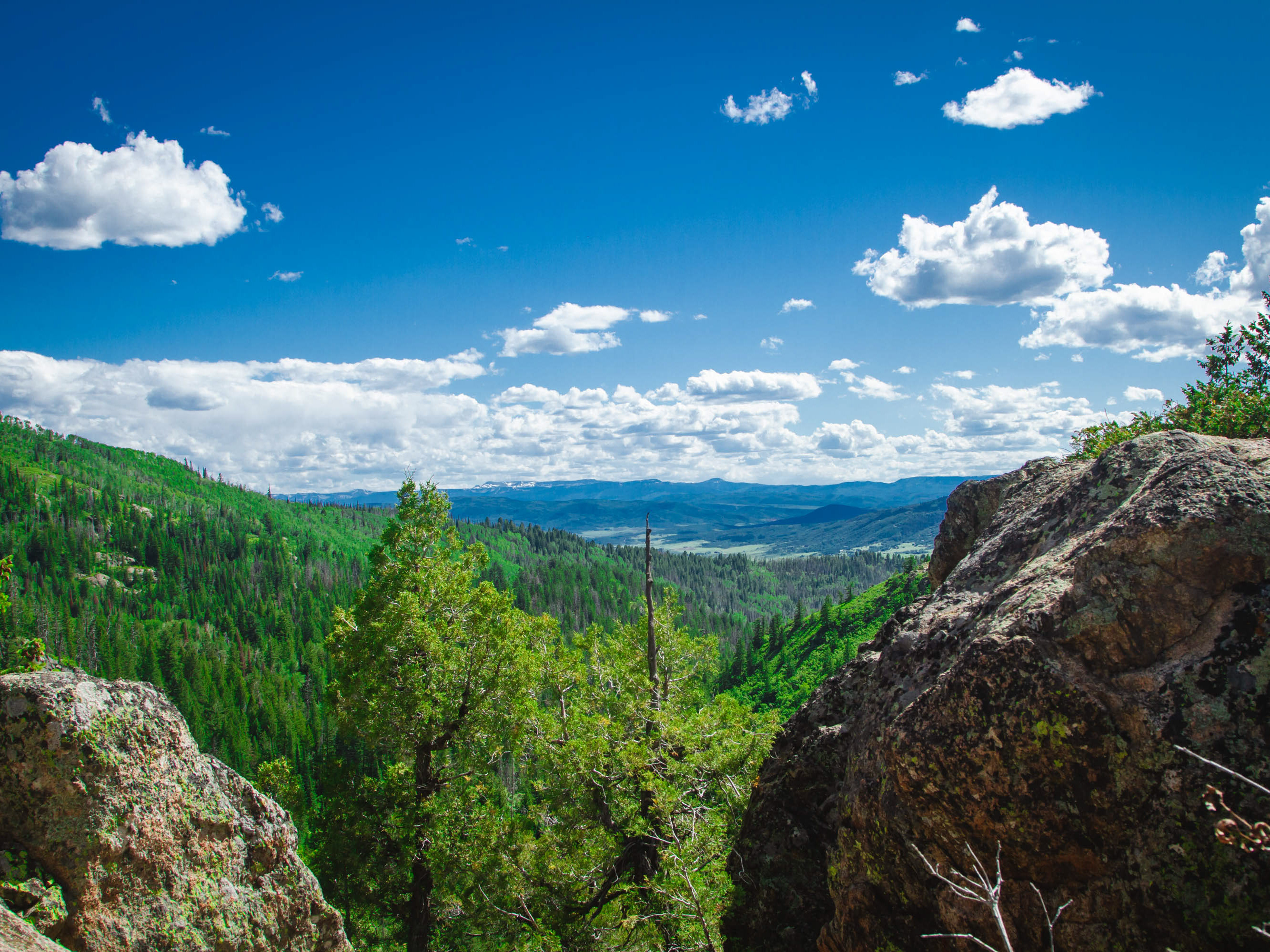
Project required the combination of a found poem and personal photography. I chose a poem by Owen Suffolk describing the feeling of freedom and combined it with images of riding bikes and training on open roads. Typographic forms were overlaid to accent the compositions. Font family Questa Grande was chosen. Printed as an 8"x10" booklet.